
INTRO
BRANDING AND wEbDESIGN
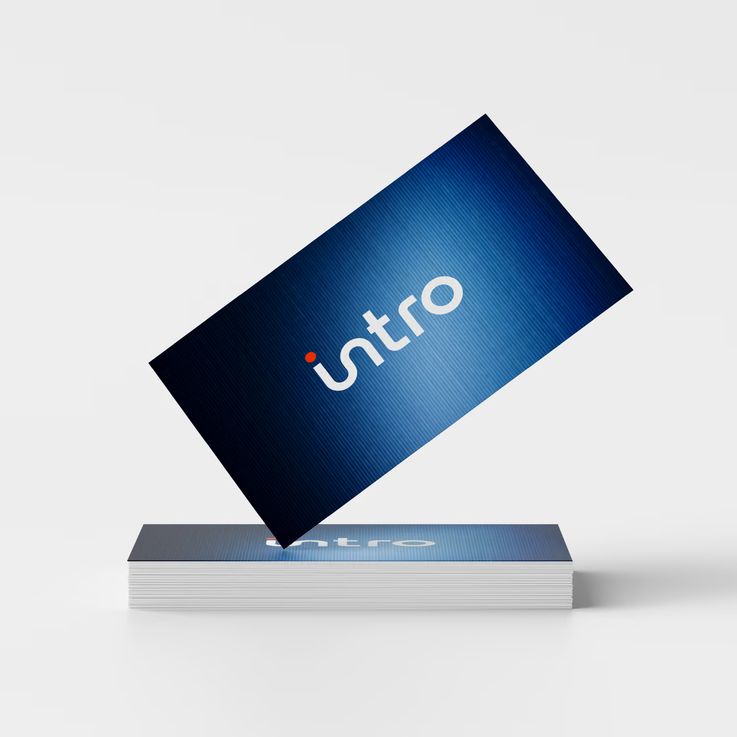
Intro is a B2B sales agency specializing in predictable customer acquisition for industrial companies. A multi-page site (Home, Services, Contact) that builds trust and clearly communicates the brand's sales-pipeline expertise. The focus was on a clean, professional look with data-driven visual elements that speaks directly to a B2B audience.
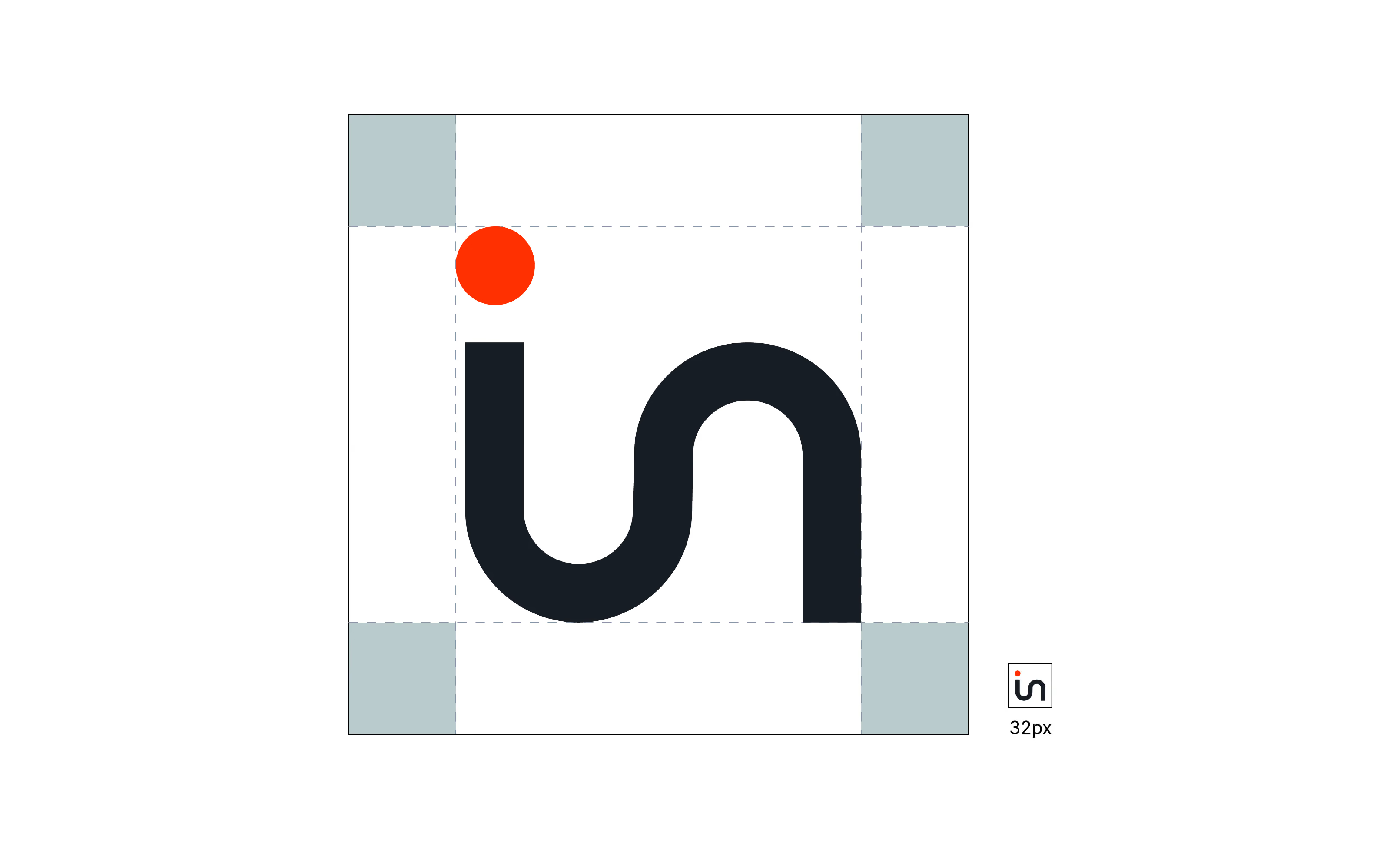
SYMBOL
Intro's logo symbol is a reduced monogram formed by the letters "i" and "n", merged into a single, flowing shape. The clean, geometric form conveys clarity and structure, while the connection between the two letters symbolizes closeness and reliability.
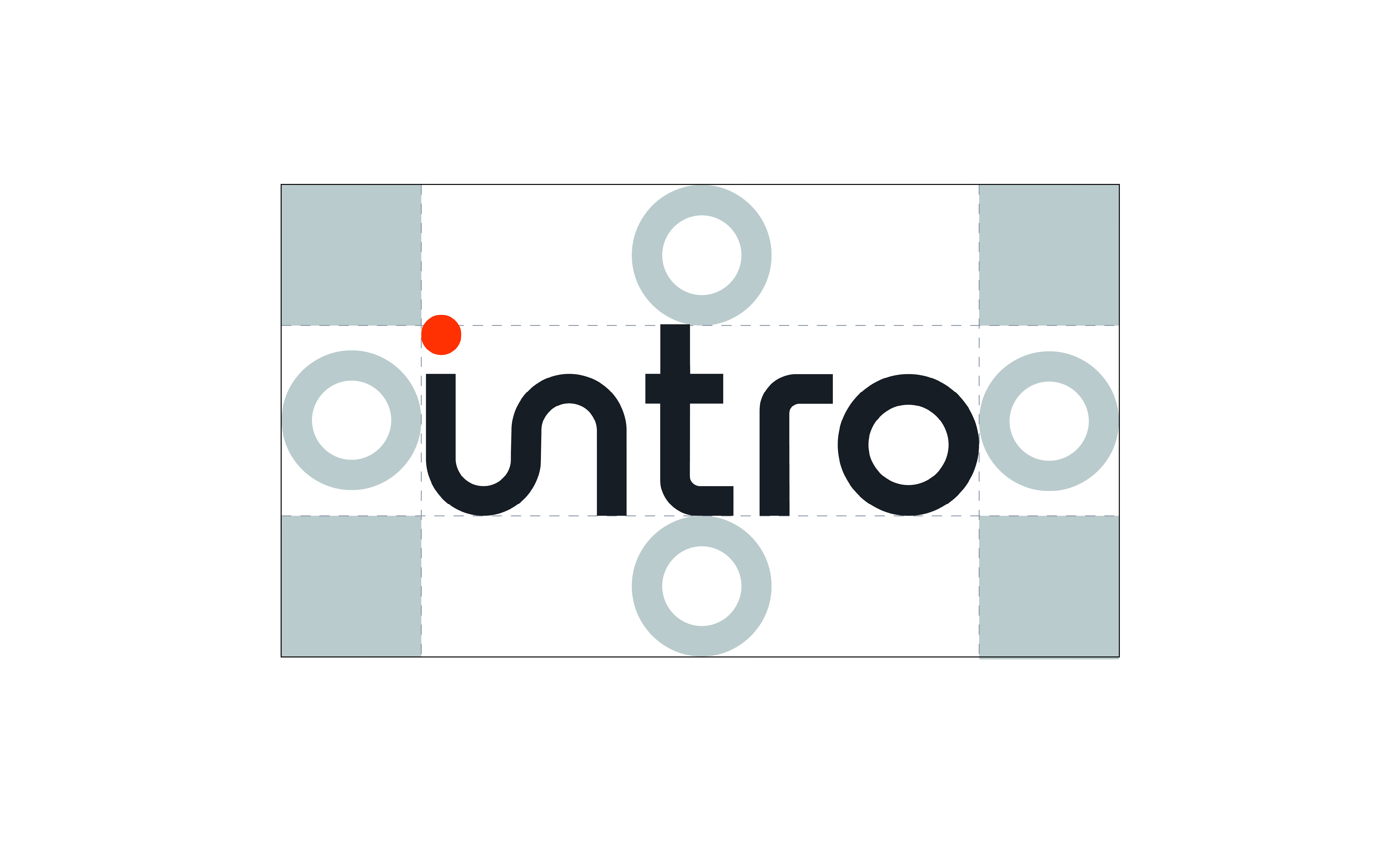
WORD MARK
Intro's word mark presents the brand name in lowercase, using a clean, rounded typography. The soft letterforms convey approachability and a modern feel, while the simple, reduced design reinforces the brand's professional positioning.
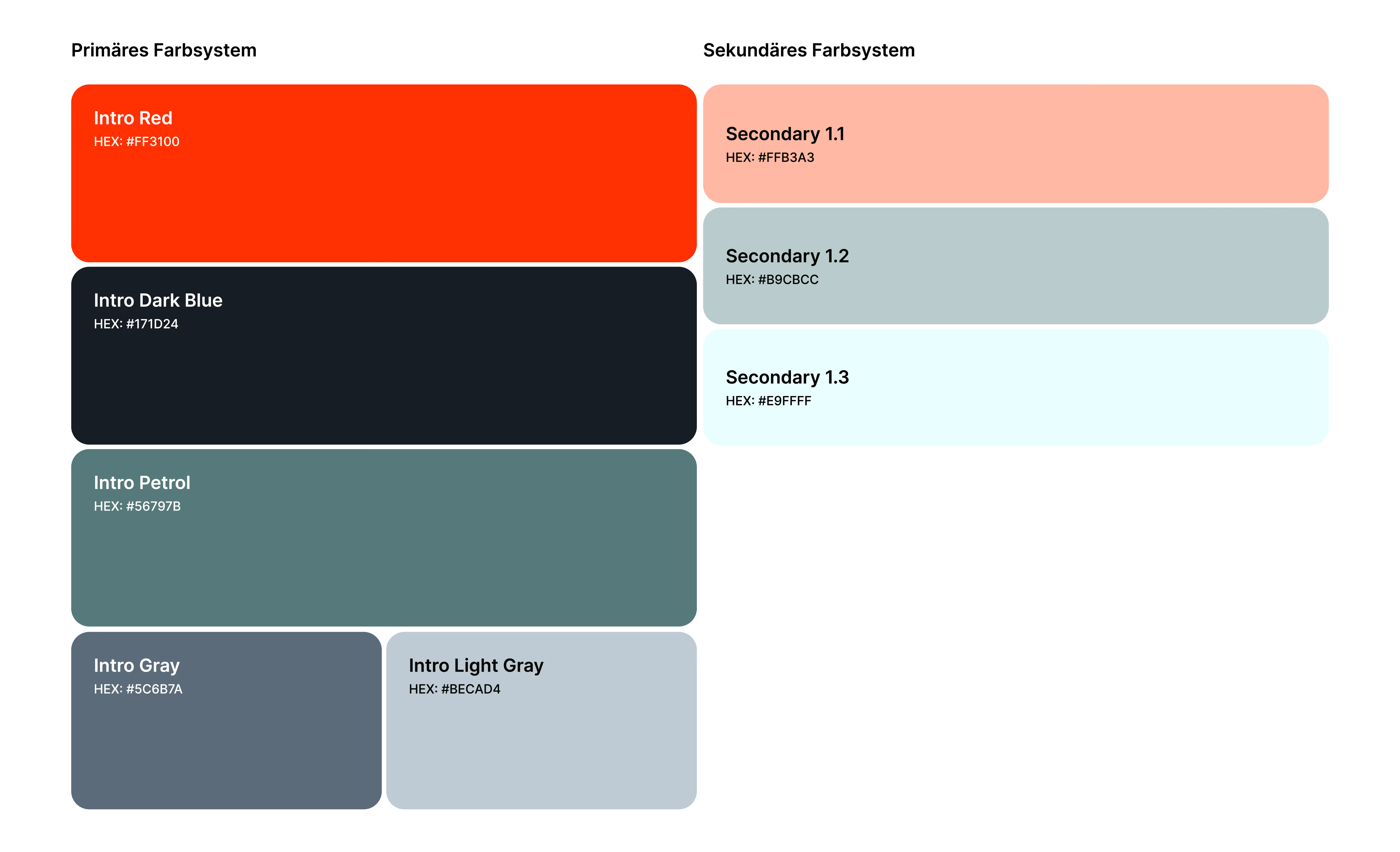
COLOUR PALETTE
Intro's color palette combines a bold Intro Red as its signal color with a deep Dark Blue and a calm Petrol tone, complemented by neutral grays. This mix of energy and restraint reflects the brand's positioning: dynamic yet trustworthy. The graduated secondary colors allow flexibility in application without diluting the brand's clear, professional impression.
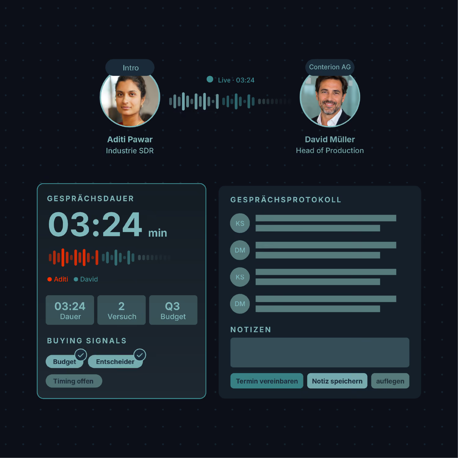
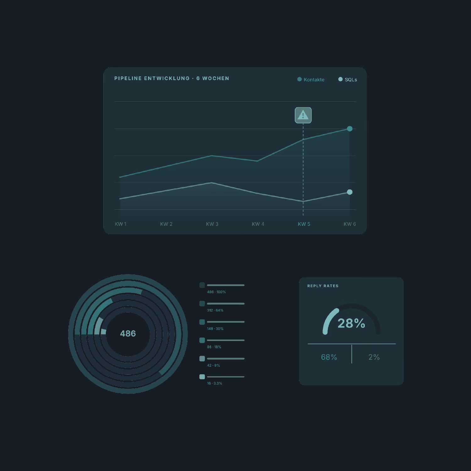
ILLUSTRATIONS.
Intro's illustrations translate the product's core functionality into clear, dark-toned dashboard visuals — from live call tracking and buying signals to pipeline progress and reply-rate analytics. The dense, data-driven visual language reinforces the brand's positioning as a precise, insight-led sales tool, giving prospects an immediate sense of the platform in action.
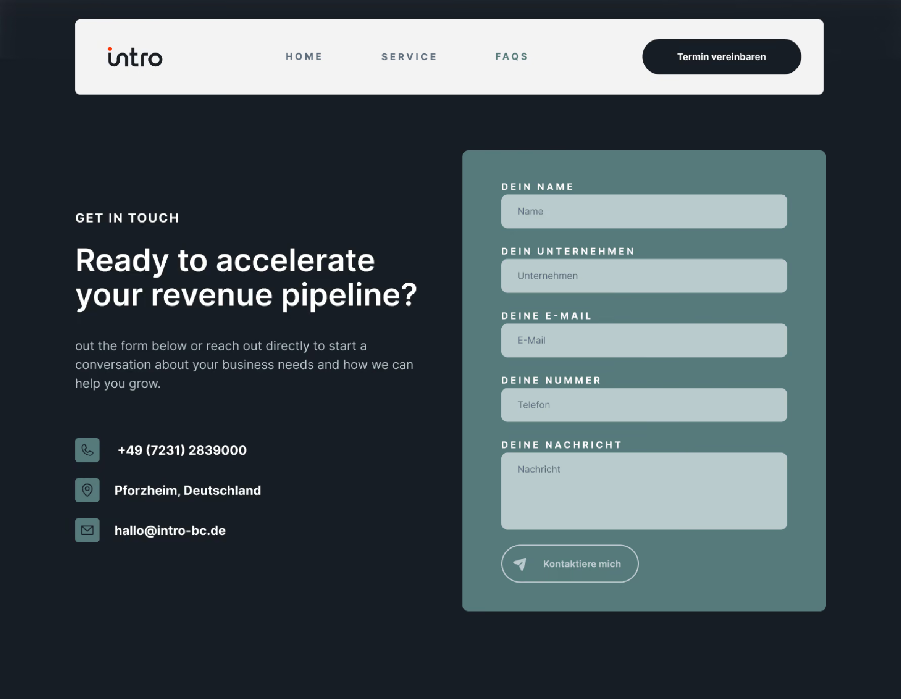
WEBDESIGN
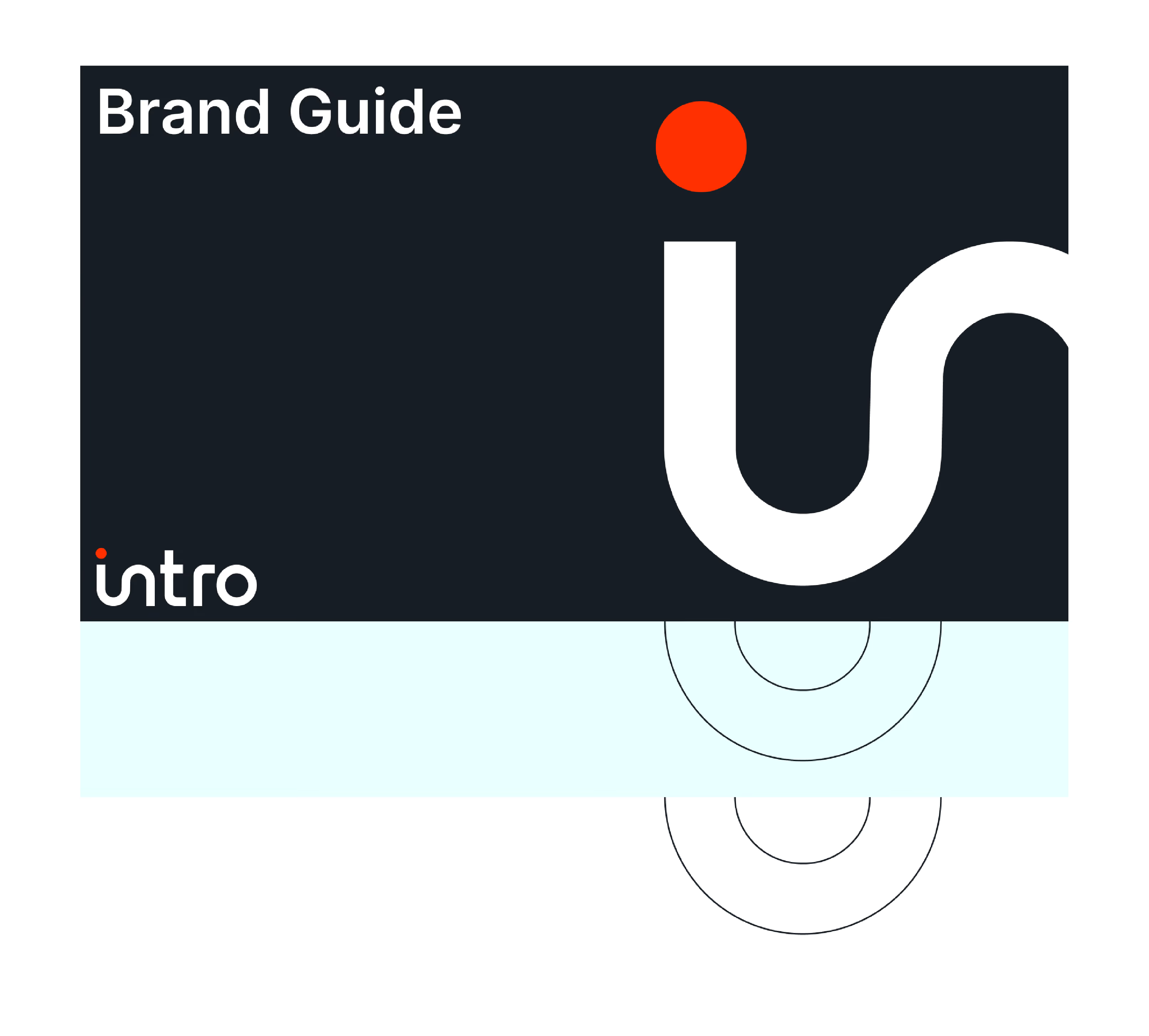
BRAND GUIDE
A structured design system document that translates Intro's visual identity into consistent, ready-to-use brand assets for all applications.